Brand - what is it good for?
This is part of a series about my side project Bashfully, which aims to give graduates and other new entrants to careers a seasoned professional level way of expressing themselves through the super power of story telling. Following the core principles of being discoverable, personalised and guiding in approach.
Brand is a large part of what people see and remember about products and services. Here I talk about the first couple of iterations of building a brand for Bashfully.
Brand is a large part of what people see and remember about products and services. Here I talk about the first couple of iterations of building a brand for Bashfully.
Initial logo
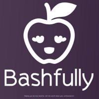
When starting out I created a logo in one evening from some clip art and an online tool. It was this rather fetching and bashful apple to the left in purple. This was used to give the twitter and git accounts some character. But it was always known that it was a placeholder logo.
This became more obvious when the first version of the landing page was created and it didn't really fit anywhere. As we have prepared the design for launch day we have solved both problems, A bit more effort into the design and what it says, plus bringing in the "brand" colours to the site design.
Second iteration
We have moved from the excellent responsive templates provided by html5up to a custom design using the Bulma framework. The html5up site was good as it allowed us to get a decent looking site up and running while we brushed down our rusty CSS skills, and concentrated on the functional side of the site and user research. Now we are getting form to fit the function and it feels the right time to spend more effort on the design and structure.
 I have also put some more thought into the logo. We both liked the purple, so have settled on the exact shade. But given the vision I wanted to convey more the "singing the praises" angle. We also both liked strong letter logos like Facebook or Google. I also wanted a font where the B would look a bit like a person ... not sure if I've achieved that!
Another subtle nod is the colour purple, we are helping people channel their inner "purple squirrel" and tell their story.
Building a style guide
 I have also started a style guide as we go along, I know what a pain this can be to create afterwards. Here I am using the Mockflow Styleguide app. This has made it dead easy to create. Although one hiccup I did have was in uploading a font file - make sure you don't have a full stop in the name!
It may not look too much at the moment, but as we add more icons and colours into the palate it's going to be really helpful in making sure we stay consistent. The other thing that is going in here are text guidelines as we develop the tone of voices and brand language.
Although I have been through whole brand development at work with the Harrison Agency and at a lower level with the 15below module names, it's not my main focus. So, it has been fun taking more of this on. Another thing that I've picked up is that red and green are good, vibrant colours for print work but in digital product you have to be careful. Red is usually used to signify destructive actions or failure. Green means success or creative actions. Likewise blue for info and orange and warnings. Not to say that you can't use them, just more care has to be taken.
My main advice for greenfield projects is, get something as a placeholder. Don't spend too much time on it until the last responsible moment.Then build the style guide as you go along. This bit can be tedious data entry, so do little and often! :-)
Further reading
- Free Brand Guidelines Template
- How to Create a Simple Brand Style Guide
- Finding Your Brand’s Voice
- A simple tip for improving your brand tone of voice guidelines
- Coolors - colour scheme generator (really useful to see how the colour palates are seen by various forms of colour blindness)


Comments
Post a Comment